The objects told us the language
This identity was drawn from the objects Boulder's music scene produced and left behind. Concert flyers, cassette tapes, record sleeves, newspaper ads. The graphic language of the era was already there. The job was to find it and bring it forward.
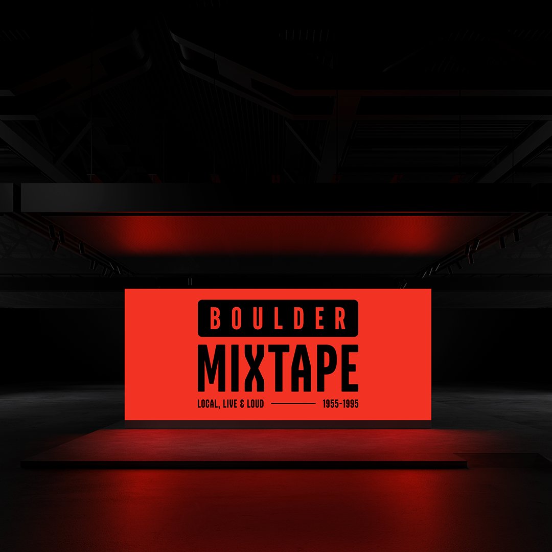
The wordmark is typographic only. Bold, condensed, and built from the same visual tradition as the album covers and packaging of the period. It doesn't announce itself as a museum identity. It feels like it belongs alongside the artifacts on display.
Inside the exhibit, the identity guides. Outside, it communicates. That's the line it holds across every application, from the banners on the street to the panel on the wall to the hat in the gift shop.
Swap this slot for the YouTube / Vimeo / Loop embed once the walkthrough is recorded.
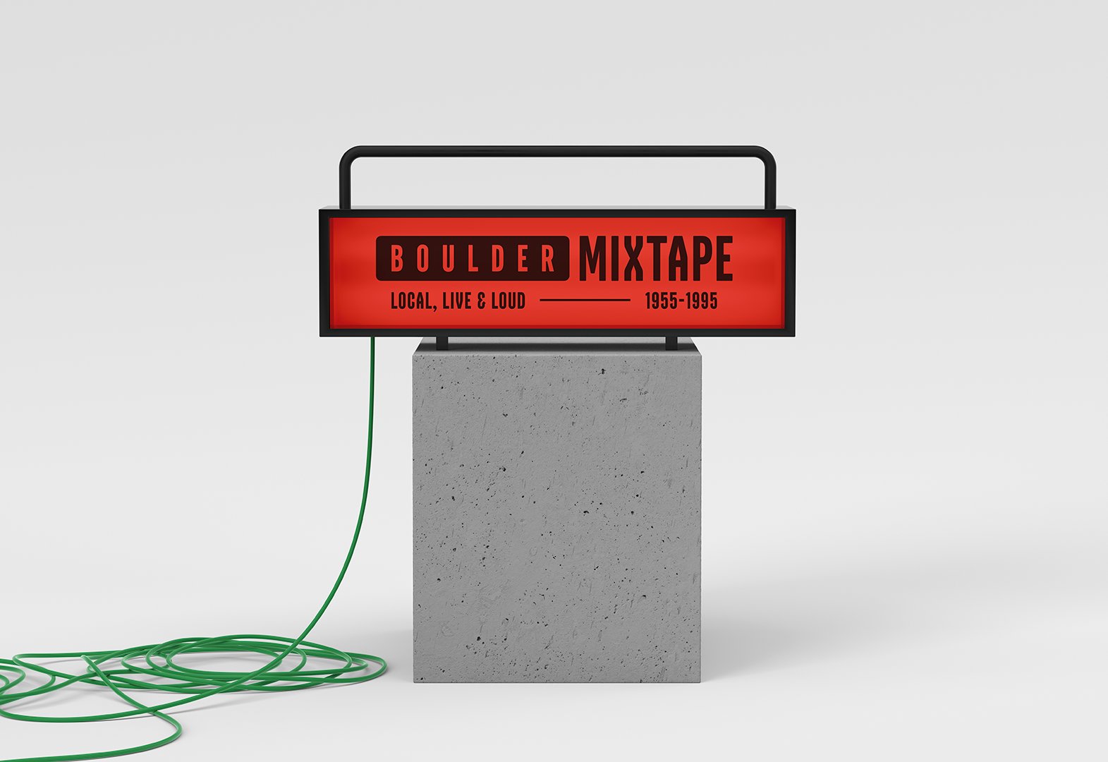
Type only, no icon
The wordmark is type only. No icon, no supporting graphic. A condensed sans serif that reads clearly at any scale, from a two inch pin to a twelve foot banner.
 Primary · positive
 Primary · reversed
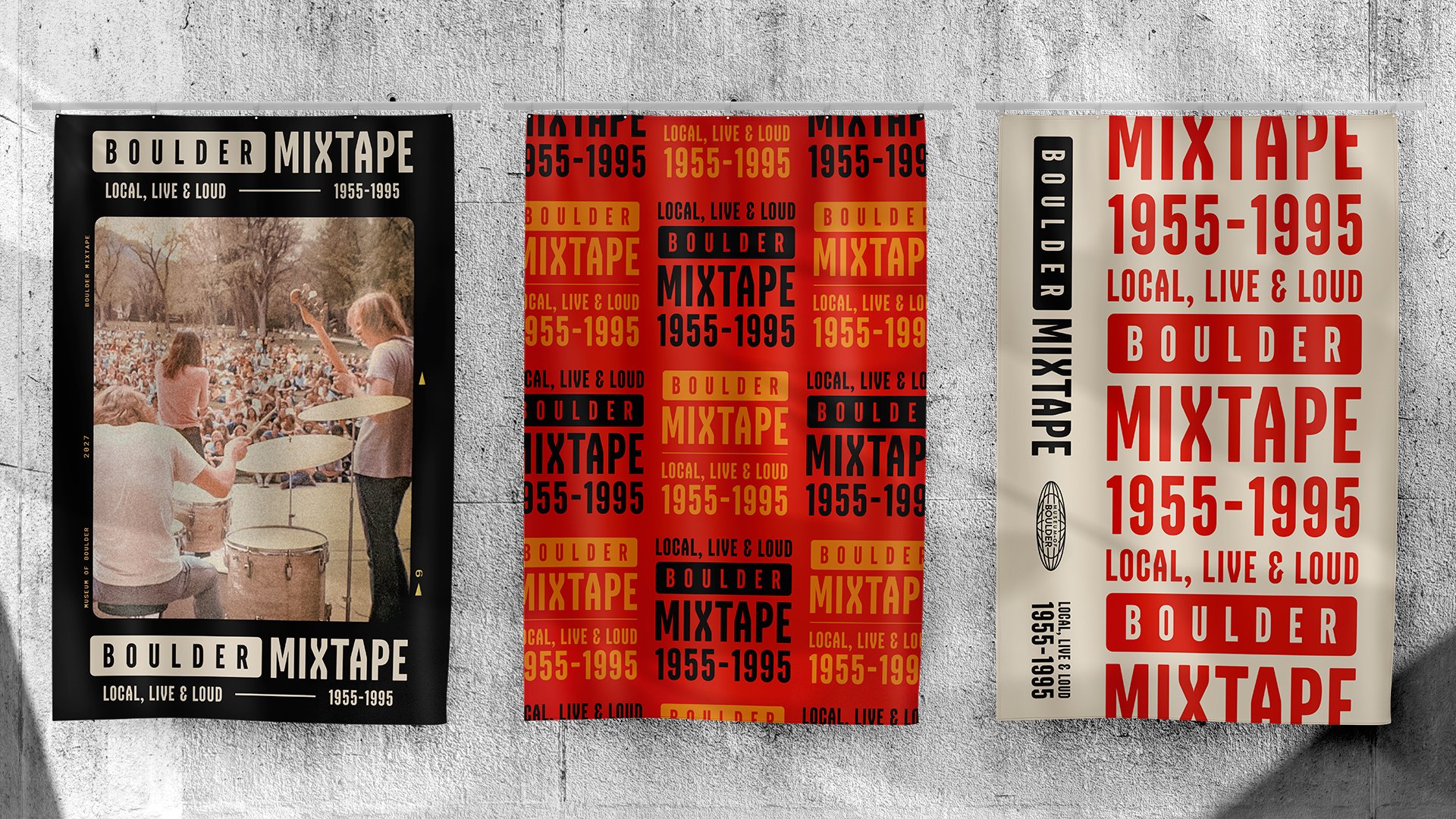
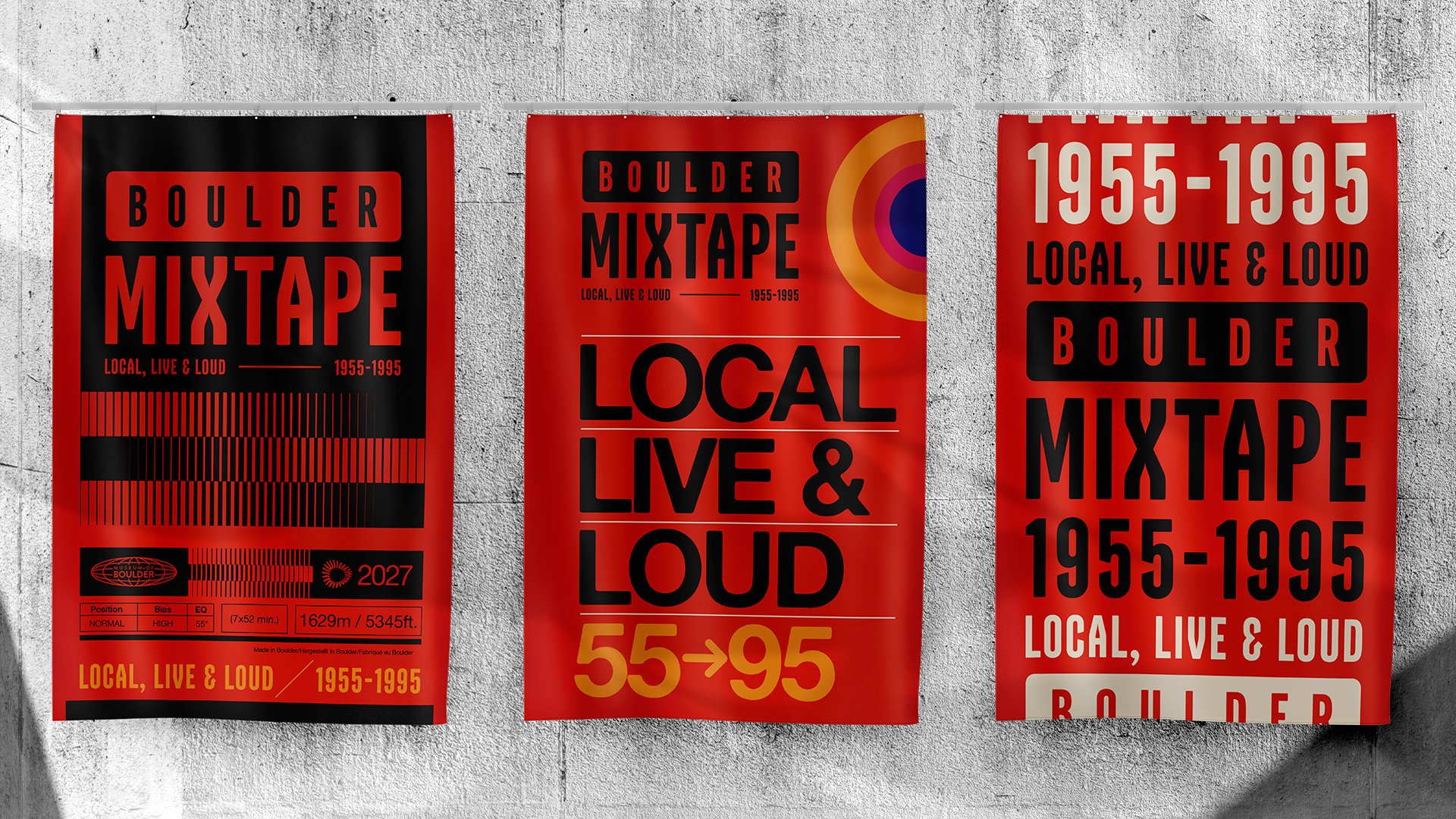
First impression, before the door
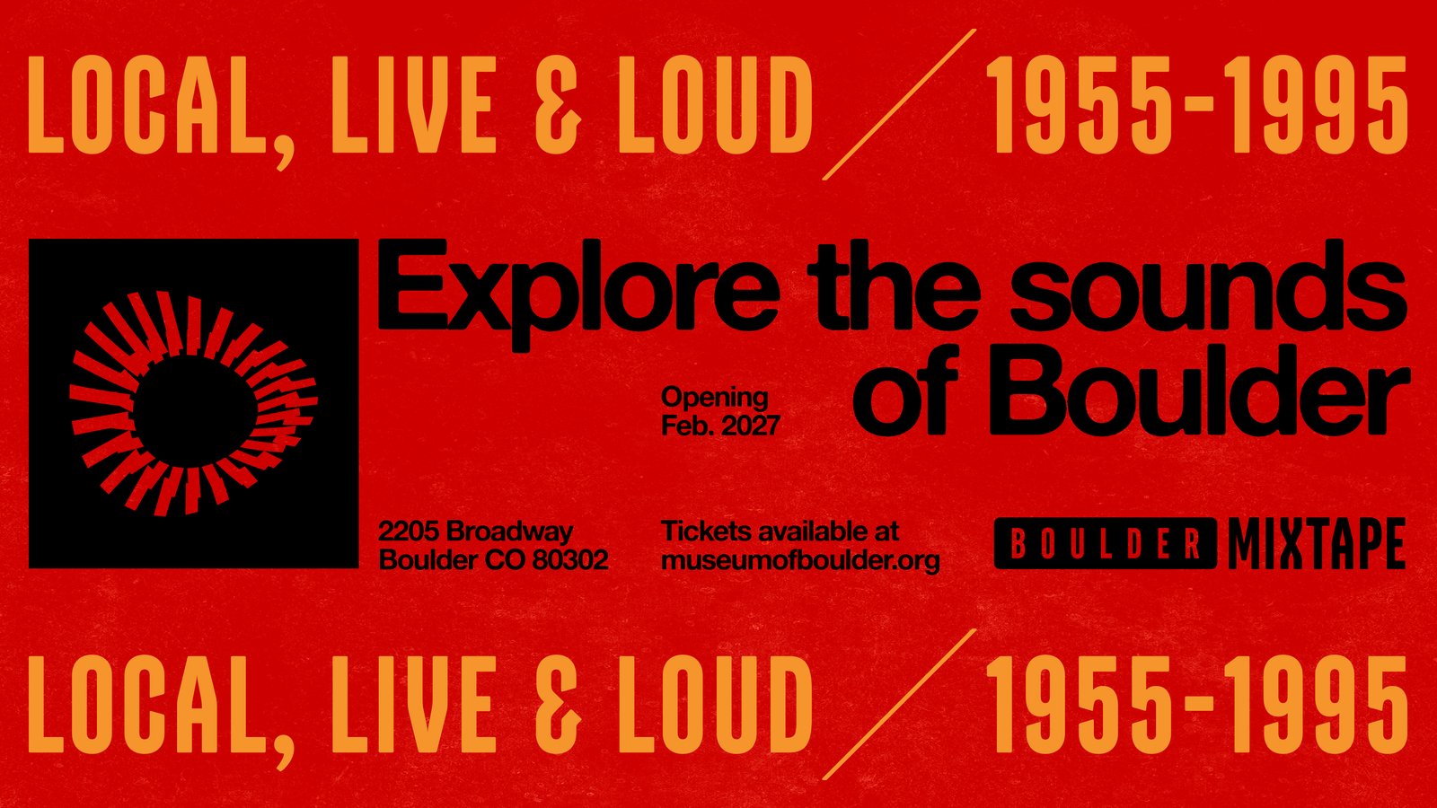
The banners establish the identity before visitors walk in. Two color treatments give the museum flexibility, a single color option for versatility and a full palette version for impact.
Setting the stage
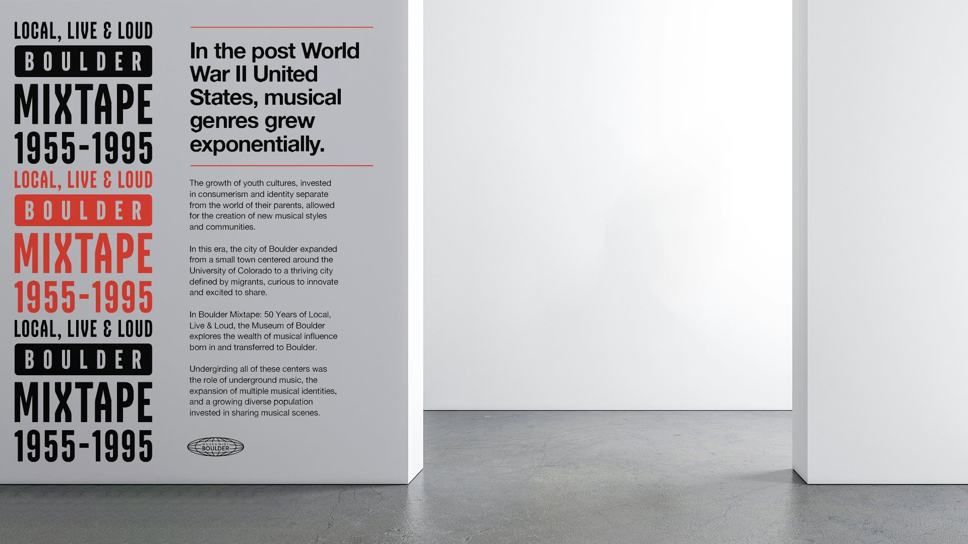
The intro wall panel is the first thing you read inside the exhibit. It carries the wordmark, the tagline, and enough context to orient you, then gets out of the way so the objects can take over.
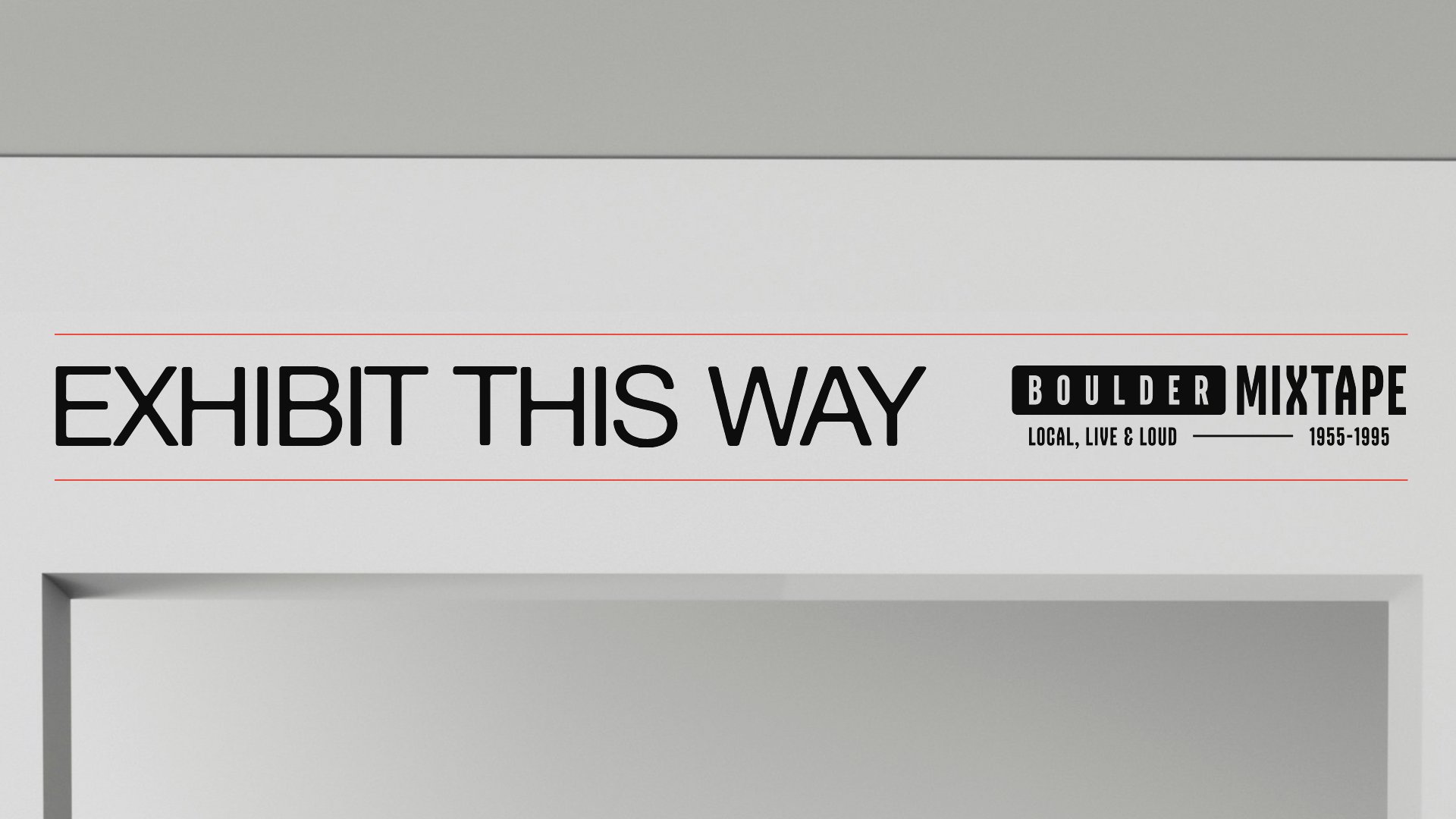
You're here
A single continuous read across the entrance. The wordmark holds the space without crowding it.
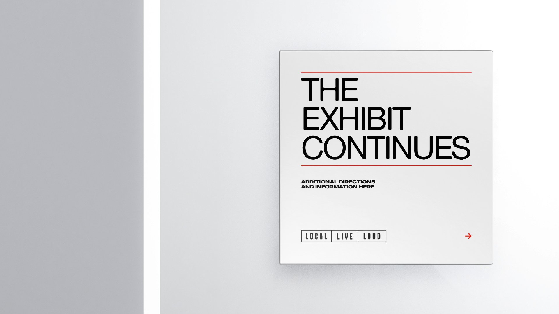
Moving through the exhibit
Wayfinding is purely typographic. Large, legible, and spare. The identity does its job and steps aside.
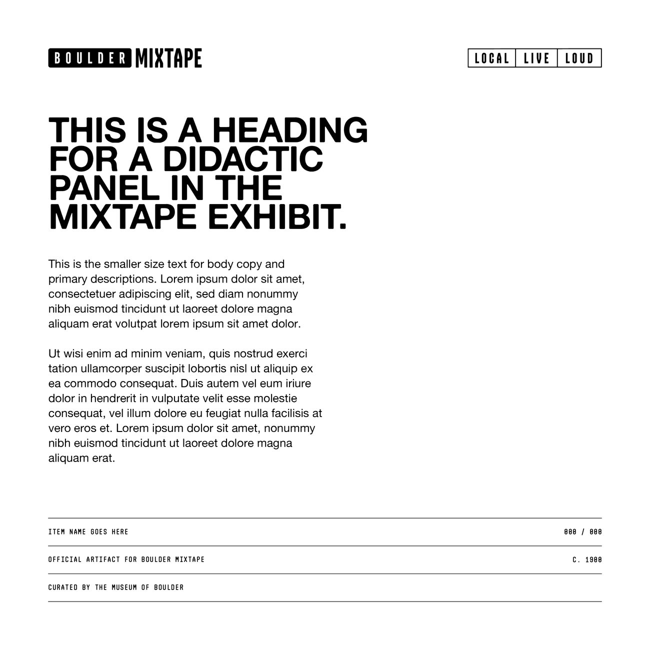
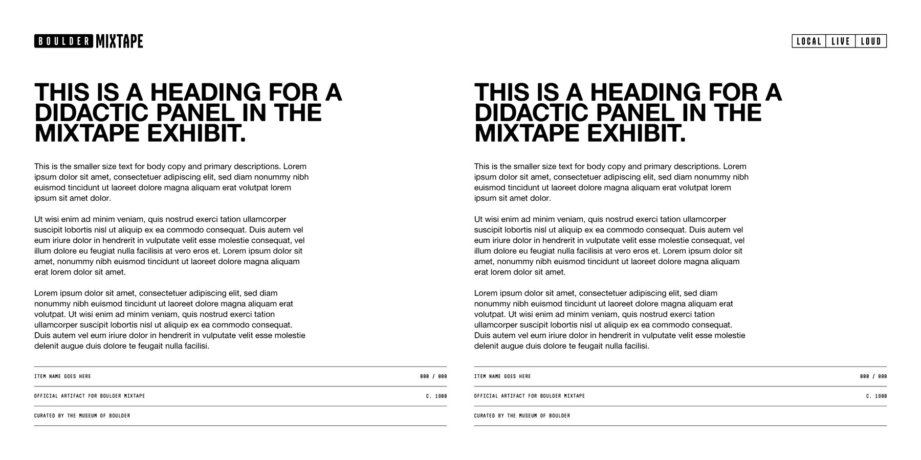
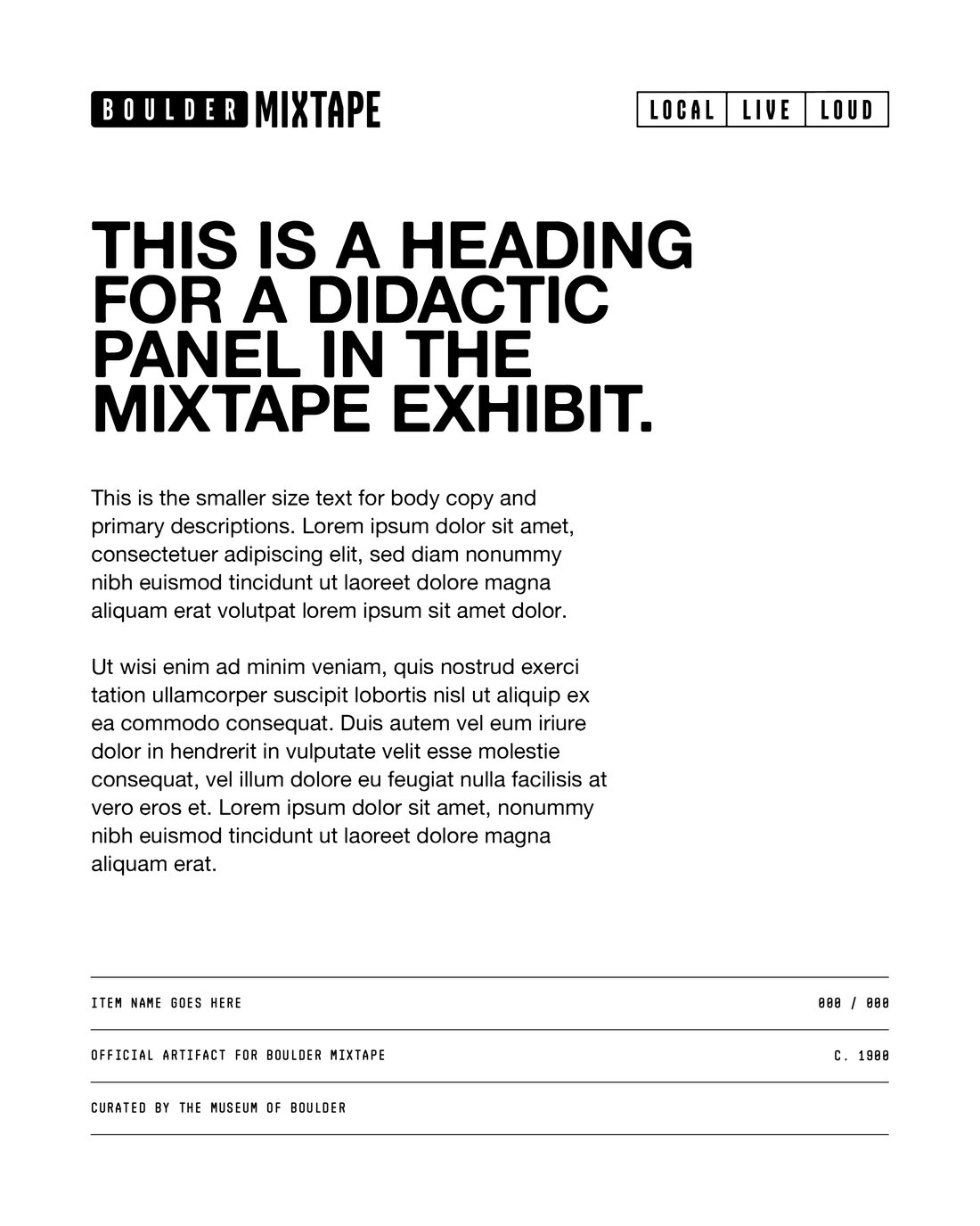
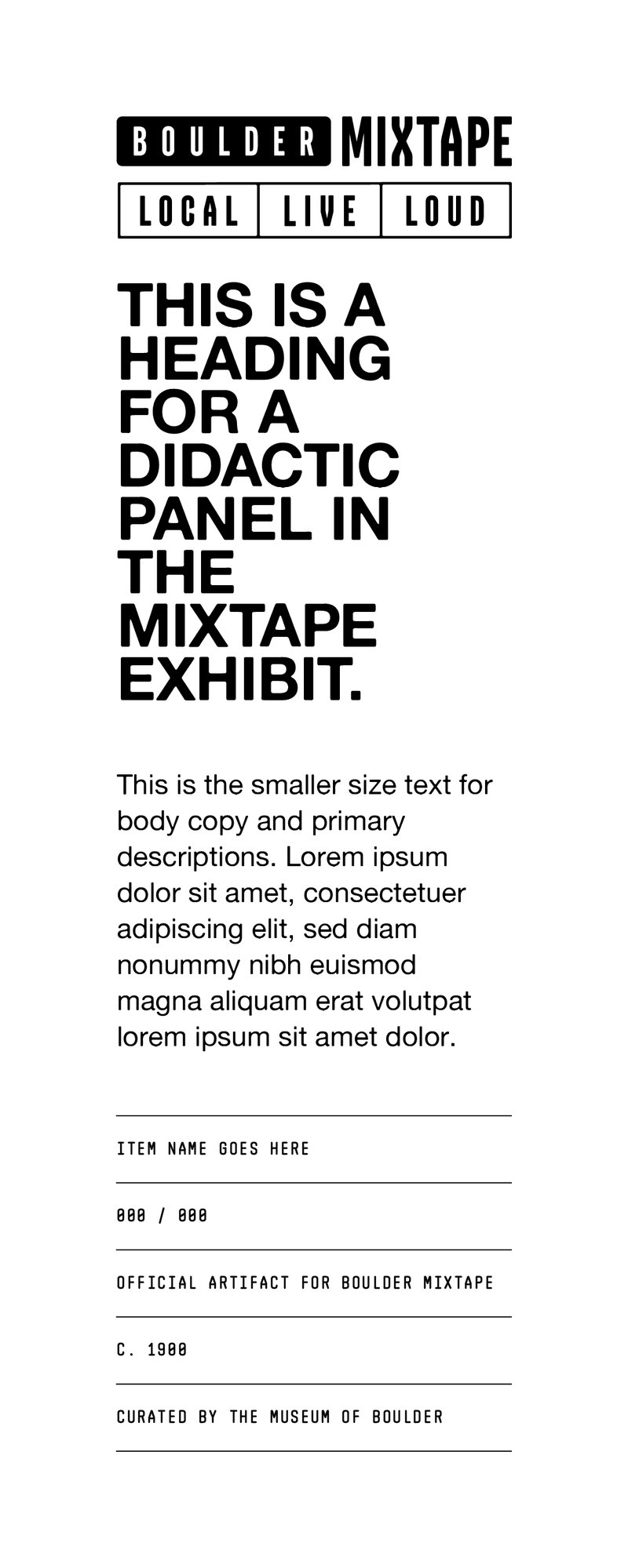
The grid that holds it together
The panel system uses a consistent grid: exhibit header at the top, heading, body text, and a page number at the bottom. It works across every format the museum needs, square, wide, and narrow, without changing the underlying logic.
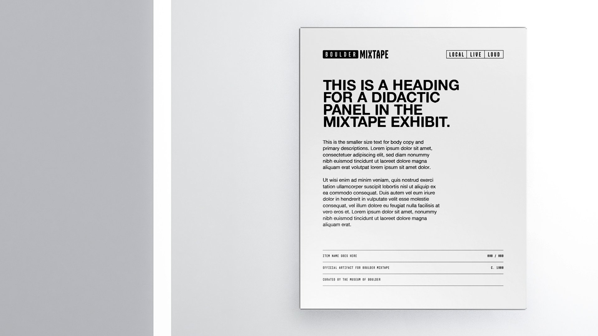
Panel format variations
The same grid, adapted to different proportions. The hierarchy stays consistent regardless of the shape.
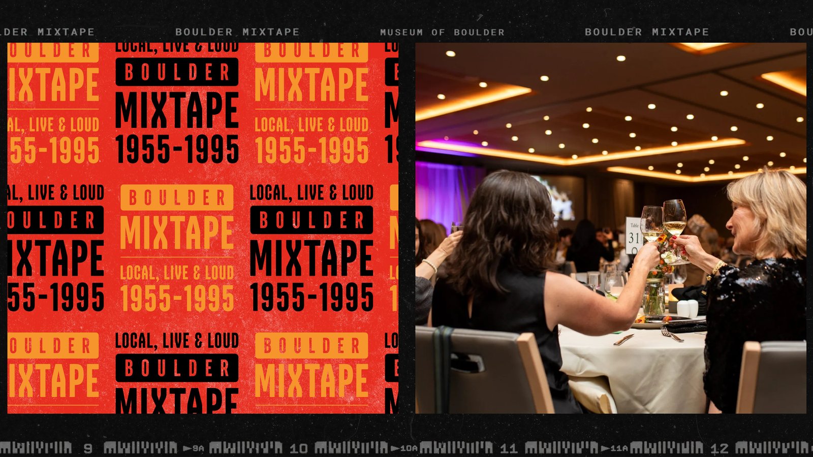
Digital advertising
The CRM formats carry the same visual language into email and digital ads. Wide format shown here.
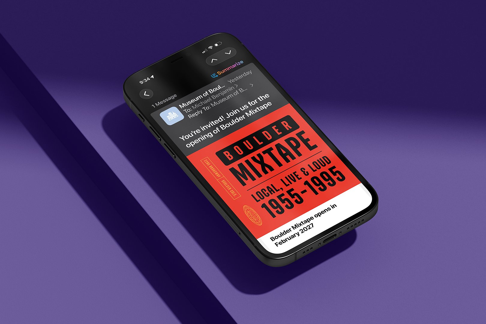
All CRM formats
Local, Live and Loud, to go
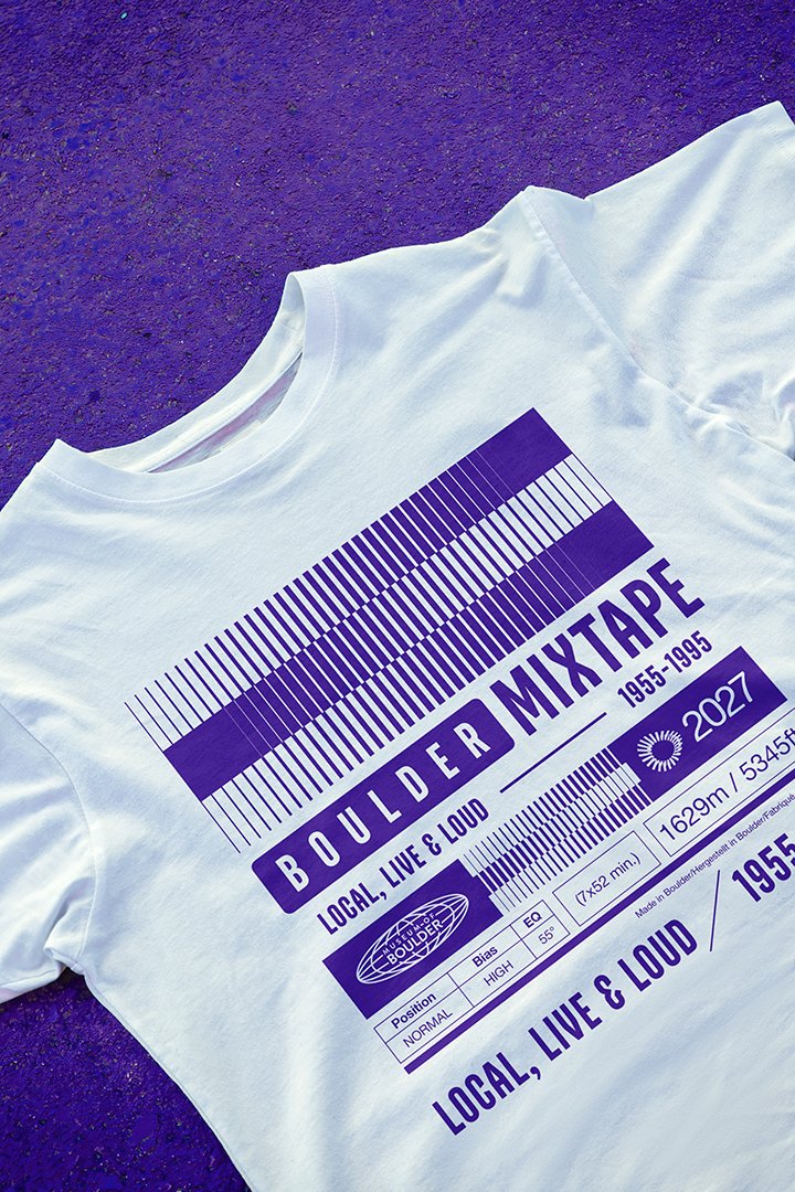
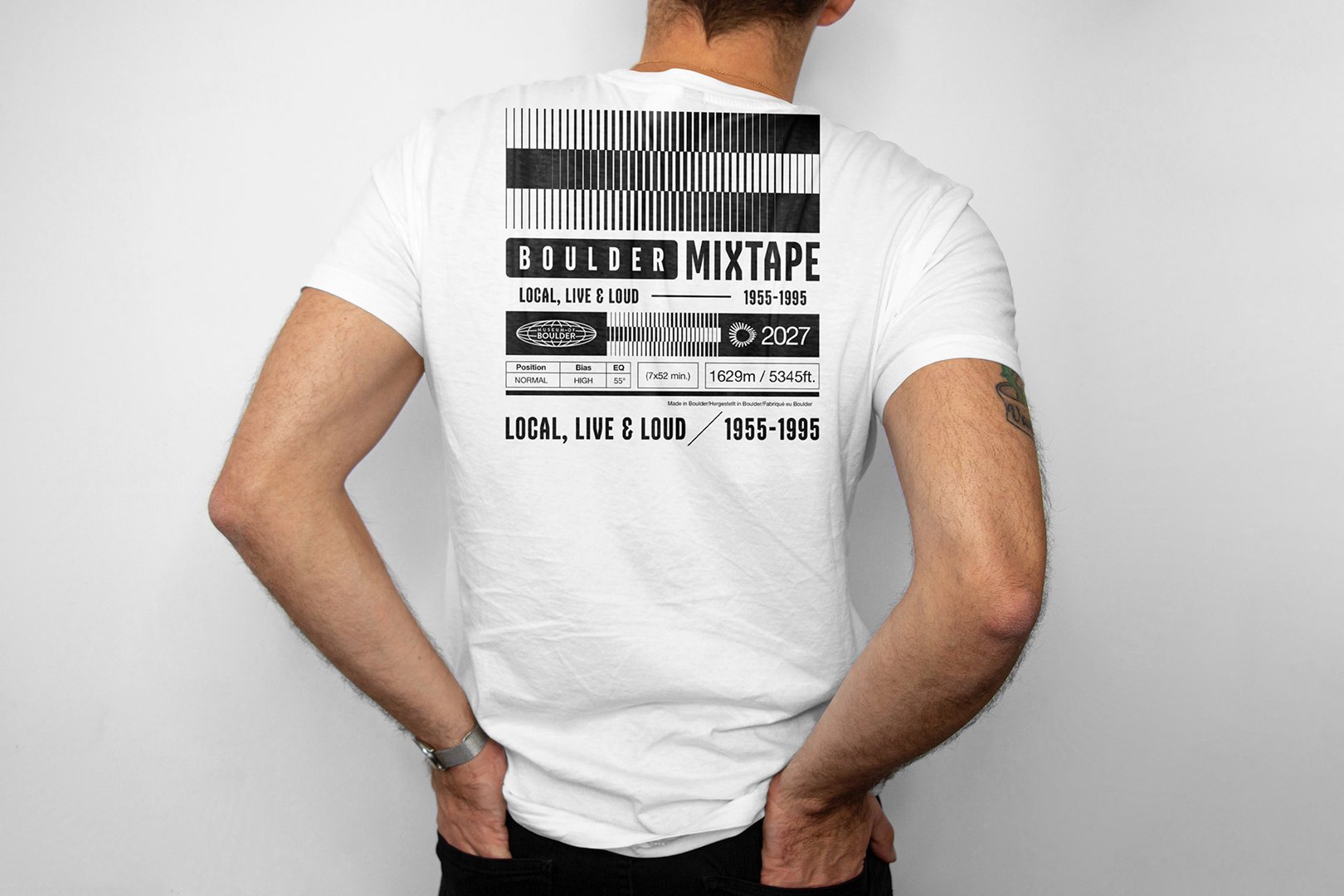
Shirts
The primary shirt leads with the wordmark. The second brings in the cassette, a nod to the exhibit's name and the era it celebrates.
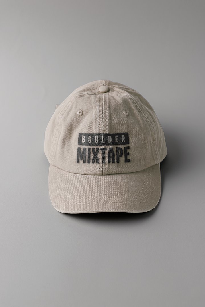
Hat
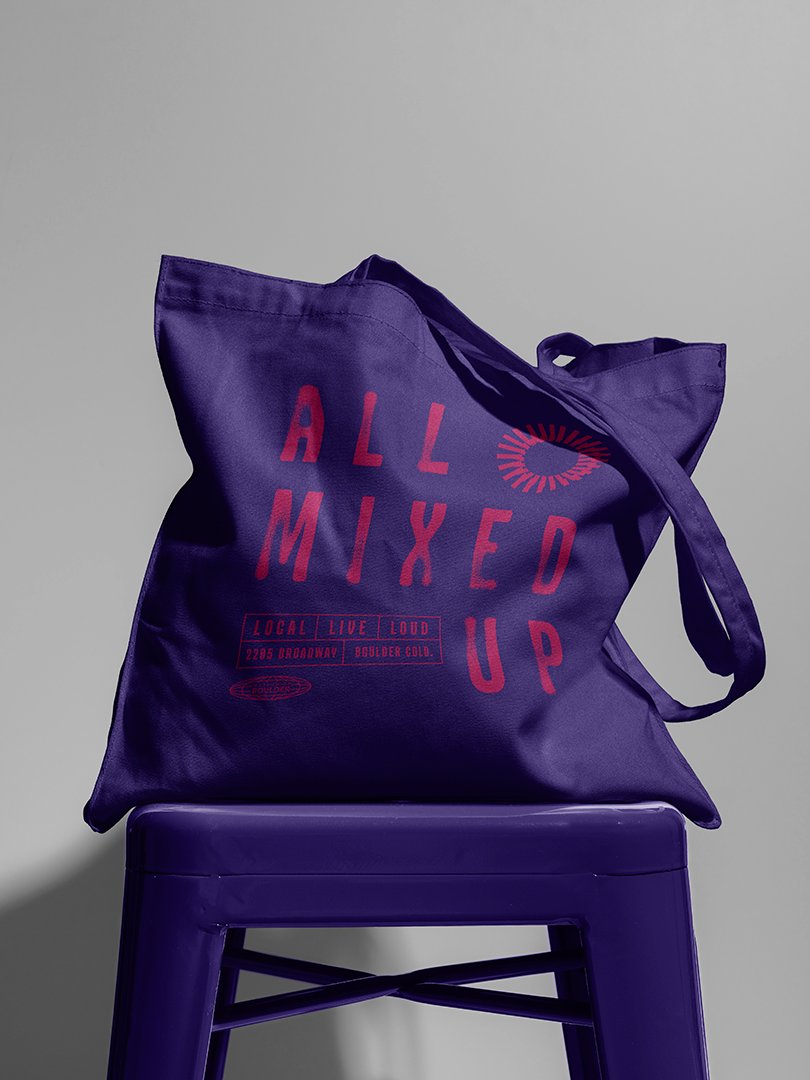
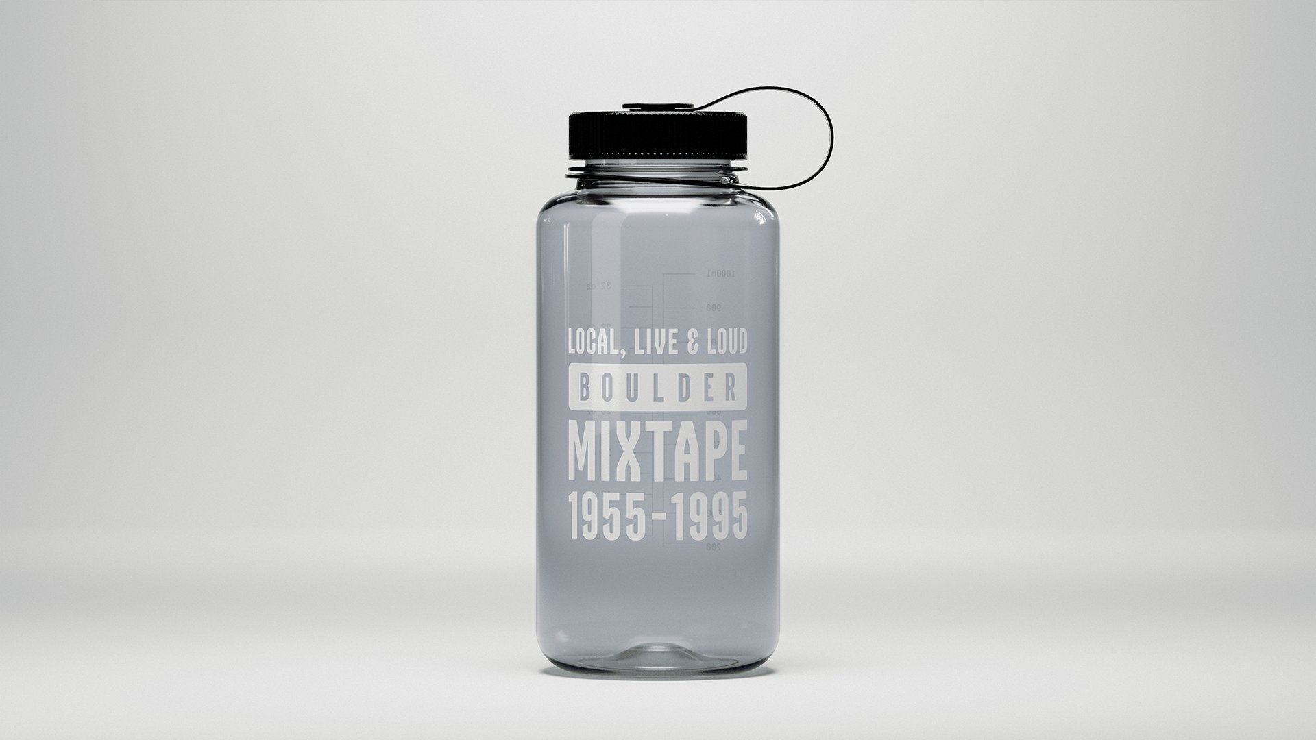
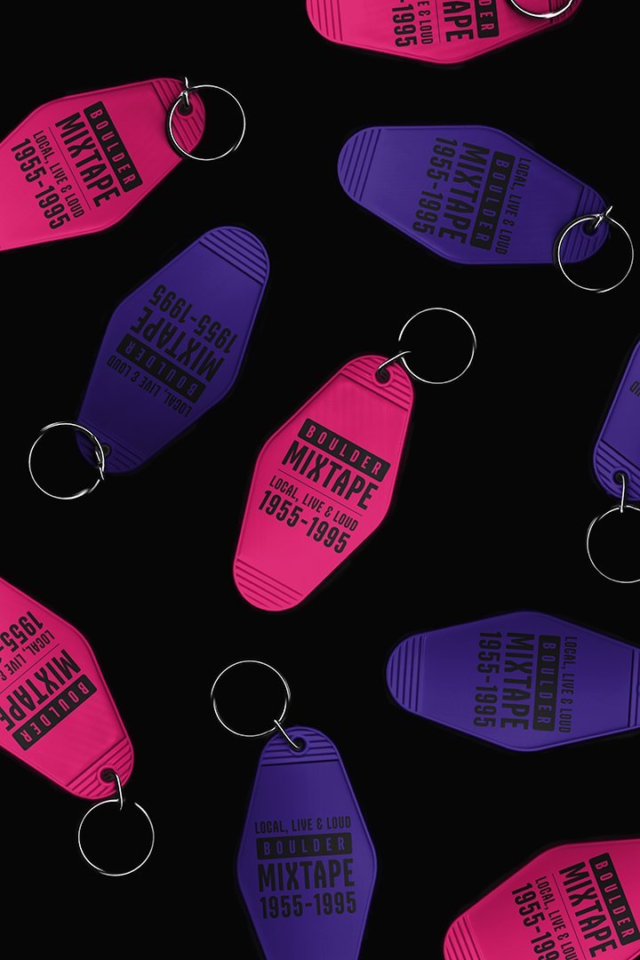
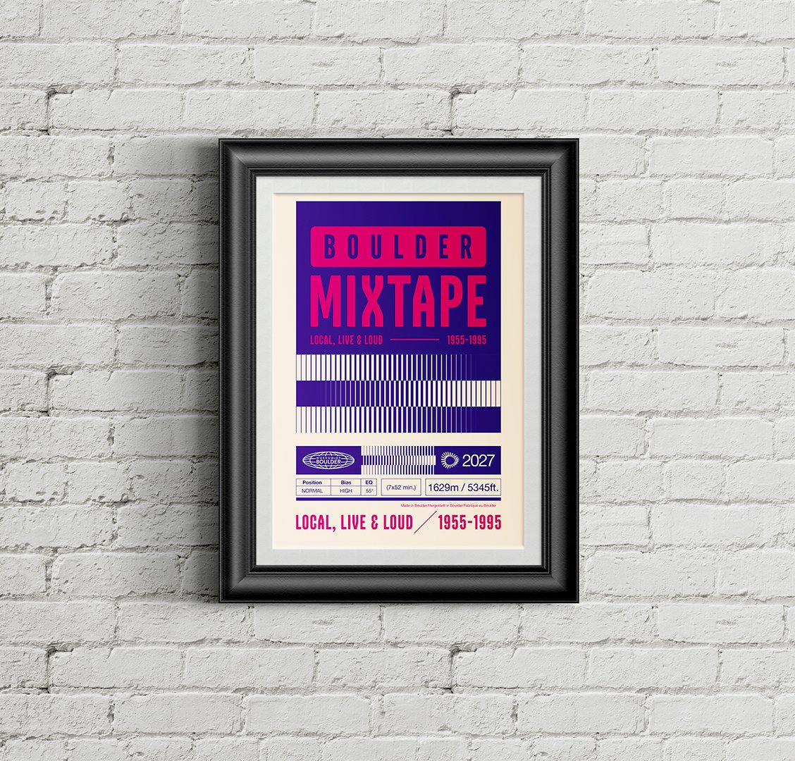
Accessories and poster
The take-home merch. Non-sized items and the collectible poster, each carrying the identity on its own. The wordmark does the work without needing anything else.
The system
Everything that makes up the Boulder Mixtape visual identity.
Color
The system starts with pure black and pure white. Red is the exhibit brand color, the one that carries Boulder Mixtape on its own. The rest are artwork accents pulled from the cassette and record packaging of the era, used across the applications. The Museum of Boulder's own purple and magenta run through everything as the shared brand colors that tie the exhibit back to the museum.
Typography
A grotesque sans serif in the tradition of album cover and packaging graphics. Used for headlines, the wordmark, and any large scale display text.
A mono-spaced typewriter face rooted in the liner notes and hand-labeled tapes of the period. Used for body text, captions, and object labels inside the exhibit.
A display face used sparingly for accents and moments of character, a nod to the era without taking over. Reserved for select headlines and graphic touches.
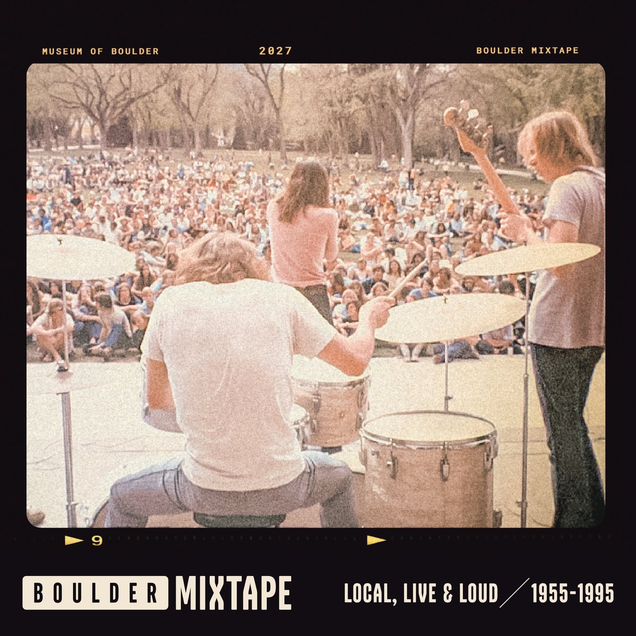
Image Treatment
All photography is presented with dark film borders and analog contact sheet markings. The treatment is consistent across every application and keeps the photography grounded in the era of the exhibit.
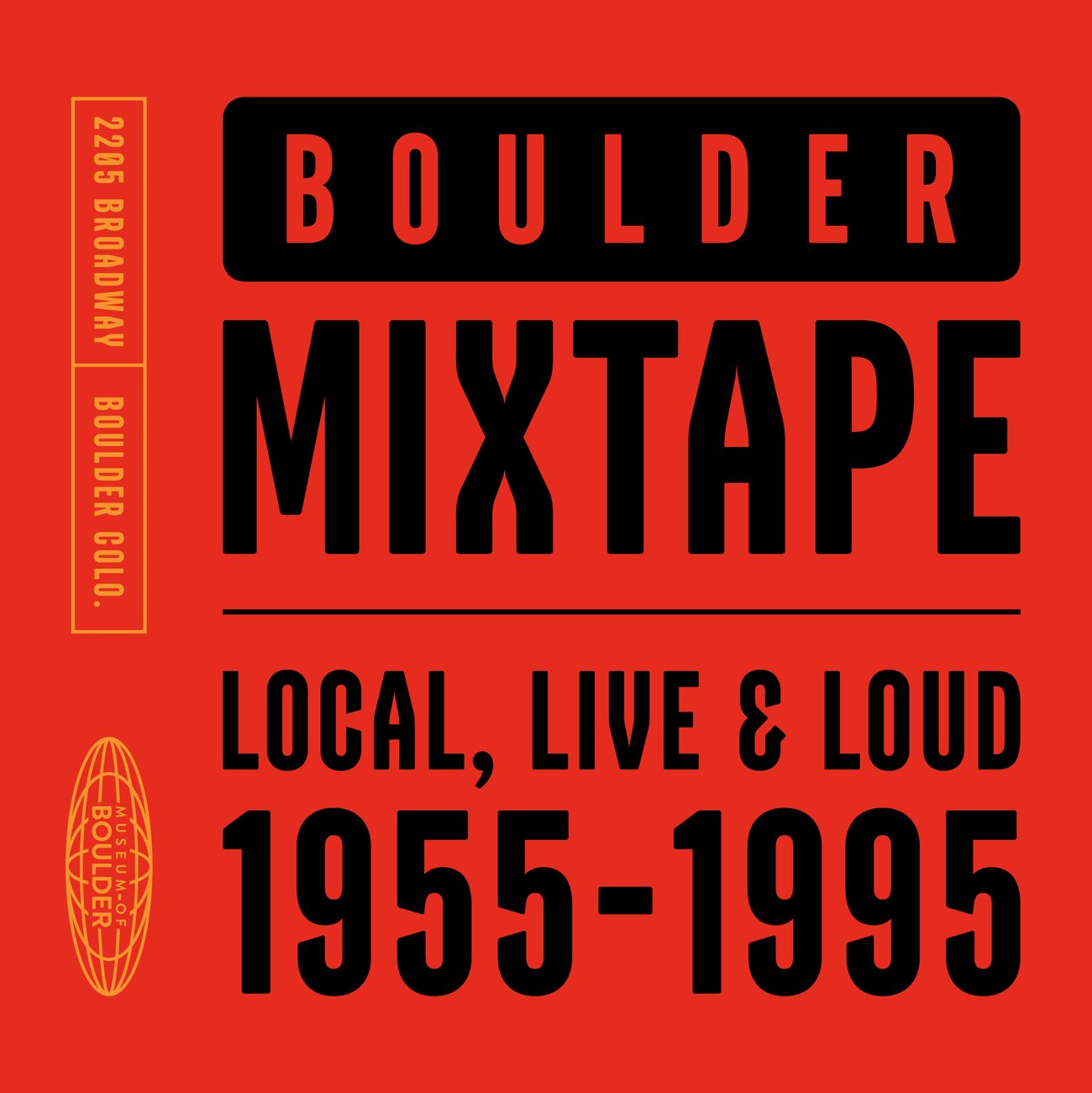
Wordmark Variations
Every approved lockup, shown positive and reversed. The wordmark lockups come first, then the supporting graphics. Use the version that fits the application, with or without the tagline and dates depending on context.


Built for the feed
The social format uses the full identity system, color, type, and layout, scaled for a square post. It's designed to stop the scroll without losing the exhibit's character.
All social formats